
Nintendo's reimagining of The Legend of Zelda: Ocarina of Time for the Nintendo Switch 2 has drawn attention for both its updated visual language and the technical choices behind presentation.
In a recent Ask the Developer interview series highlighted by Nintendo Life, the game's creative leads detailed how the team approached modernizing a 1998 Nintendo 64 classic while preserving its original spirit.
Background
Ocarina of Time was originally released for the Nintendo 64 in 1998 and remains one of Nintendo's most influential titles.
For the Switch 2 reimagining, Nintendo's art and design teams set out to leverage the newer hardware to produce richer visuals without sacrificing the game's defining atmosphere and character identity.
Art direction and concept sketches
Art Director Aya Shida told the development interviewers the team deliberately balanced increased realism with the distinctive, somewhat darker tone of the original.
Shida described the visual brief as aiming for an analogue, practical-effects sensibility — a “puppet-show feel” that would make characters appear tangible within their fantasy worlds.
In journalistic terms, she said the goal was to ensure characters felt genuinely present in their environments while retaining the game's established, sometimes eerie characterizations.
That approach meant preserving each character's familiar presence before layering new, game-specific design elements on top.
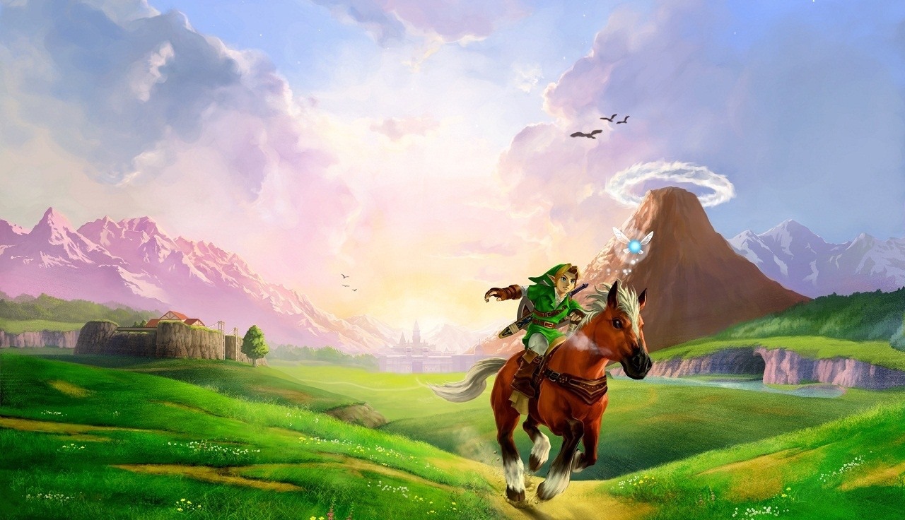
For example, Child Link remains instantly recognisable while sporting more elaborate costume details in the reimagined version.
Nintendo shared early concept sketches from the art team as part of the interview series, offering a window into those iterative design decisions.
Maps and continuity
Director HokWai Ng emphasized a similar preservation of the game's geography.
He explained that the team avoided altering the feel of locations or how locations connect, both elements that define Ocarina of Time.
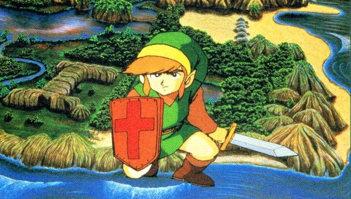
To support that, the development team commissioned a new map from one of the artists who contributed illustrations for the original N64 release, linking the remake visually to its origin.
Technical choices: SMAA and AMD FSR
Footage of the game's preloaded intellectual property notice circulating on social media lists AMD FSR 1.0 and SMAA among third-party technologies, with no mention of Nvidia's DLSS.
Nintendo has used a similar approach on other recent titles such as Donkey Kong Bananza.
Reviewers and viewers who have seen early material note the game's presentation remains strong despite these choices; the development team appears to have prioritized a consistent visual style that aligns with the art direction described by Shida and Ng.
Conclusion
Nintendo's public developer comments and shared concept art make clear the Switch 2 version of Ocarina of Time is a careful remake: it leans on new hardware capabilities while consciously preserving the character-driven, location-focused identity that defined the original.
The combination of a deliberate art brief and specific technical tools shapes what players will ultimately experience when the title appears on the Nintendo eShop and in Nintendo-led showcases such as Nintendo Direct.
In a recent Ask the Developer interview series highlighted by Nintendo Life, the game's creative leads detailed how the team approached modernizing a 1998 Nintendo 64 classic while preserving its original spirit.
Background
Ocarina of Time was originally released for the Nintendo 64 in 1998 and remains one of Nintendo's most influential titles.
For the Switch 2 reimagining, Nintendo's art and design teams set out to leverage the newer hardware to produce richer visuals without sacrificing the game's defining atmosphere and character identity.
Art direction and concept sketches
Art Director Aya Shida told the development interviewers the team deliberately balanced increased realism with the distinctive, somewhat darker tone of the original.
Shida described the visual brief as aiming for an analogue, practical-effects sensibility — a “puppet-show feel” that would make characters appear tangible within their fantasy worlds.
In journalistic terms, she said the goal was to ensure characters felt genuinely present in their environments while retaining the game's established, sometimes eerie characterizations.
That approach meant preserving each character's familiar presence before layering new, game-specific design elements on top.
For example, Child Link remains instantly recognisable while sporting more elaborate costume details in the reimagined version.
Nintendo shared early concept sketches from the art team as part of the interview series, offering a window into those iterative design decisions.
Maps and continuity
Director HokWai Ng emphasized a similar preservation of the game's geography.
He explained that the team avoided altering the feel of locations or how locations connect, both elements that define Ocarina of Time.
To support that, the development team commissioned a new map from one of the artists who contributed illustrations for the original N64 release, linking the remake visually to its origin.
Technical choices: SMAA and AMD FSR
Footage of the game's preloaded intellectual property notice circulating on social media lists AMD FSR 1.0 and SMAA among third-party technologies, with no mention of Nvidia's DLSS.
Nintendo has used a similar approach on other recent titles such as Donkey Kong Bananza.
Reviewers and viewers who have seen early material note the game's presentation remains strong despite these choices; the development team appears to have prioritized a consistent visual style that aligns with the art direction described by Shida and Ng.
Conclusion
Nintendo's public developer comments and shared concept art make clear the Switch 2 version of Ocarina of Time is a careful remake: it leans on new hardware capabilities while consciously preserving the character-driven, location-focused identity that defined the original.
The combination of a deliberate art brief and specific technical tools shapes what players will ultimately experience when the title appears on the Nintendo eShop and in Nintendo-led showcases such as Nintendo Direct.