Nintendo Switch users recently experienced a significant visual change with the latest system update that brings not only new features but also a major redesign to the Nintendo Switch eShop.
As Nintendo continues to evolve its popular hybrid console platform and gears up for the highly anticipated Switch 2, this update marks a notable shift in the company's branding approach.
The June 2024 Nintendo Switch update introduced two substantial features: Virtual Game Cards and GameShare.
These enhancements are aimed at improving game management and sharing capabilities for users, aligning with Nintendo’s focus on community-driven experiences as the current generation approaches its twilight years.
While these new features gained headlines, many longtime Nintendo fans immediately noticed the cosmetic overhaul of the eShop.
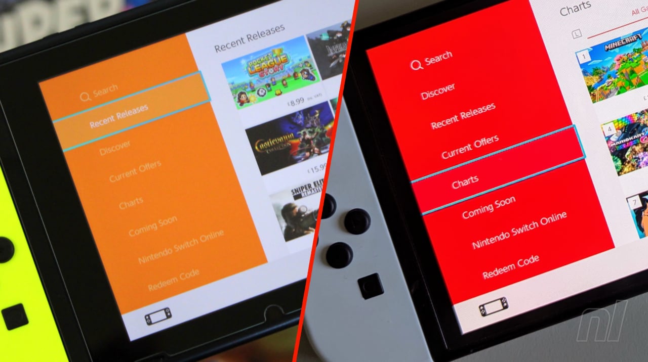
Since its debut on the Nintendo 3DS in 2011 and later on the Wii U and Nintendo Switch, the eShop interface was instantly recognizable for its distinct orange accent.
Now, Nintendo has transitioned the eShop’s primary color from orange to a bold, bright red.
This update appears designed to reinforce the broader Nintendo and Switch branding, which commonly features red as a signature color across packaging, marketing, and hardware.
Fan reactions to the new red eShop design have been swift and passionate.
Highlighted in a recent IGN report, some users took to social media to express nostalgia for the orange look that had become synonymous with Nintendo’s digital storefronts.
One notable post came from community member @BoTalksGames, who remarked that the orange eShop had remained a staple of Nintendo’s digital ecosystem from 2011 all the way through 2025, spanning three generations: the 3DS, Wii U, and Nintendo Switch.
This sentiment underscores just how deeply the visual identity of the eShop is intertwined with Nintendo’s modern history.
While initial impressions of the red design are mixed, some users have observed that the new color scheme offers better legibility thanks to increased contrast between the white text and the vibrant background.
Others, however, reminisce about the softer, more inviting orange hue that defined their many digital purchases and browsing sessions over the years.
For Nintendo, the decision to refresh the Switch eShop aligns the digital experience with its broader brand identity and the impending transition to the next generation of hardware.
As the company readies the Switch 2 and continues to update its digital platforms, maintaining a cohesive and recognizable look appears to be a priority.
Whether fans prefer the classic orange or the new red aesthetic, one thing is certain: the Nintendo Switch eShop remains a crucial part of the platform’s ecosystem, connecting millions of players to their favorite digital games and experiences.
As this new chapter unfolds, Nintendo continues to balance innovation with nostalgia—a hallmark of its enduring appeal.
As Nintendo continues to evolve its popular hybrid console platform and gears up for the highly anticipated Switch 2, this update marks a notable shift in the company's branding approach.
The June 2024 Nintendo Switch update introduced two substantial features: Virtual Game Cards and GameShare.
These enhancements are aimed at improving game management and sharing capabilities for users, aligning with Nintendo’s focus on community-driven experiences as the current generation approaches its twilight years.
While these new features gained headlines, many longtime Nintendo fans immediately noticed the cosmetic overhaul of the eShop.
Since its debut on the Nintendo 3DS in 2011 and later on the Wii U and Nintendo Switch, the eShop interface was instantly recognizable for its distinct orange accent.
Now, Nintendo has transitioned the eShop’s primary color from orange to a bold, bright red.
This update appears designed to reinforce the broader Nintendo and Switch branding, which commonly features red as a signature color across packaging, marketing, and hardware.
Fan reactions to the new red eShop design have been swift and passionate.
Highlighted in a recent IGN report, some users took to social media to express nostalgia for the orange look that had become synonymous with Nintendo’s digital storefronts.
One notable post came from community member @BoTalksGames, who remarked that the orange eShop had remained a staple of Nintendo’s digital ecosystem from 2011 all the way through 2025, spanning three generations: the 3DS, Wii U, and Nintendo Switch.
This sentiment underscores just how deeply the visual identity of the eShop is intertwined with Nintendo’s modern history.
While initial impressions of the red design are mixed, some users have observed that the new color scheme offers better legibility thanks to increased contrast between the white text and the vibrant background.
Others, however, reminisce about the softer, more inviting orange hue that defined their many digital purchases and browsing sessions over the years.
For Nintendo, the decision to refresh the Switch eShop aligns the digital experience with its broader brand identity and the impending transition to the next generation of hardware.
As the company readies the Switch 2 and continues to update its digital platforms, maintaining a cohesive and recognizable look appears to be a priority.
Whether fans prefer the classic orange or the new red aesthetic, one thing is certain: the Nintendo Switch eShop remains a crucial part of the platform’s ecosystem, connecting millions of players to their favorite digital games and experiences.
As this new chapter unfolds, Nintendo continues to balance innovation with nostalgia—a hallmark of its enduring appeal.