Box Art Brawl: Super Mario World 2 Yoshi's Island – Comparing Classic SNES Covers
As classic Nintendo games continue to captivate both veteran fans and new audiences, the legacy of their original releases remains a topic of fascination.
One feature often celebrated by collectors and retro gaming enthusiasts is box art, those vivid covers that once lined store shelves and now serve as nostalgic windows to the past.
This week, Box Art Brawl takes a close look at Super Mario World 2: Yoshi's Island, a seminal title for the Super Nintendo Entertainment System (SNES) that has delighted players since its original debut over 25 years ago.
Released on August 5, 1995, Yoshi's Island redefined platforming with its unique art style and gameplay innovations, and its enduring appeal is evident through ongoing digital re-releases on the Nintendo Switch and eShop.
Recently celebrating its 25th anniversary, Super Mario World 2: Yoshi's Island continues to be recognized as one of developer Nintendo EAD’s standout achievements.
As part of this celebration, we're examining the regional box art variants that accompanied the title’s launch in markets worldwide, focusing on their design differences and what they reveal about local gaming culture.
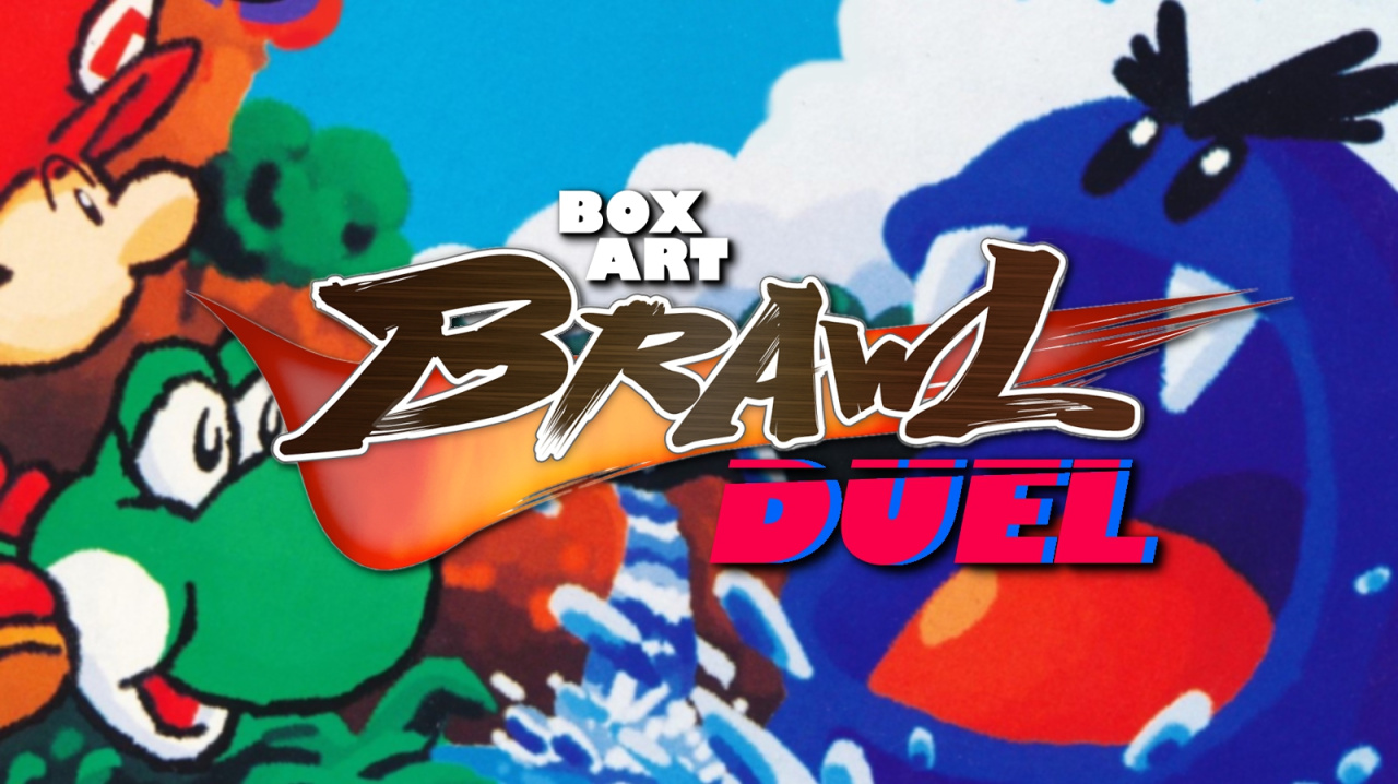
European and North American Cover Art
In Western regions, the Super Mario World 2: Yoshi's Island box art presented an action-packed scene.
The cover prominently features a large blue Nep-Enut monster, creating a striking focal point that draws viewers in.
Meanwhile, Yoshi and Baby Mario showcase the distinctive crayon-like visuals and playful character design that became signature aspects of the game.
Although variations existed across Europe, such as changes to the iconic 'Only For' corner or adjustments to the border color for Player's Choice editions, the principal artwork and logo remained consistent.
The Western logo notably incorporates an egg as the 'O' in Yoshi’s name—a playful nod to the game's central mechanics.
However, some critics note that the busier composition and logo design, while playful, may overshadow the lush graphical style that set Yoshi's Island apart on the SNES.
Japanese Cover Art
Transitioning eastward, the Japanese release, known as 'Yossy Island,' employs a softer, pastel-infused aesthetic.
The Japanese box art features a colorful lineup of multiple Yoshis alongside a subdued yet appealing image of Baby Mario floating in a protective bubble.
In contrast to the Western release, the Japanese cover better communicates the game’s art direction, emphasizing its storybook qualities and inviting players into Yoshi’s whimsical world.
The background includes fluffy clouds and an idyllic depiction of the island, while the stylized logo is rendered with a unique folded green ribbon, setting it apart visually from its Western counterpart.
This distinctly Japanese approach reflects a broader appreciation for charming, character-driven visuals that often permeate Nintendo’s domestic releases.
Voting and Community Engagement
Every week, Box Art Brawl invites the gaming community to vote for their favorite classic cover artwork, celebrating the diverse history and design sensibilities that have characterized Nintendo’s global releases.
As Super Mario World 2: Yoshi's Island marks another milestone year, fans once again weigh in on which regional design best represents the spirit of this beloved SNES title.
Stay tuned for more retrospectives on Nintendo’s illustrious catalog, and join ongoing conversations about box art, classic game development, and collector culture both in upcoming Nintendo Directs and across the growing libraries of Nintendo Switch and eShop releases.
As classic Nintendo games continue to captivate both veteran fans and new audiences, the legacy of their original releases remains a topic of fascination.
One feature often celebrated by collectors and retro gaming enthusiasts is box art, those vivid covers that once lined store shelves and now serve as nostalgic windows to the past.
This week, Box Art Brawl takes a close look at Super Mario World 2: Yoshi's Island, a seminal title for the Super Nintendo Entertainment System (SNES) that has delighted players since its original debut over 25 years ago.
Released on August 5, 1995, Yoshi's Island redefined platforming with its unique art style and gameplay innovations, and its enduring appeal is evident through ongoing digital re-releases on the Nintendo Switch and eShop.
Recently celebrating its 25th anniversary, Super Mario World 2: Yoshi's Island continues to be recognized as one of developer Nintendo EAD’s standout achievements.
As part of this celebration, we're examining the regional box art variants that accompanied the title’s launch in markets worldwide, focusing on their design differences and what they reveal about local gaming culture.
European and North American Cover Art
In Western regions, the Super Mario World 2: Yoshi's Island box art presented an action-packed scene.
The cover prominently features a large blue Nep-Enut monster, creating a striking focal point that draws viewers in.
Meanwhile, Yoshi and Baby Mario showcase the distinctive crayon-like visuals and playful character design that became signature aspects of the game.
Although variations existed across Europe, such as changes to the iconic 'Only For' corner or adjustments to the border color for Player's Choice editions, the principal artwork and logo remained consistent.
The Western logo notably incorporates an egg as the 'O' in Yoshi’s name—a playful nod to the game's central mechanics.
However, some critics note that the busier composition and logo design, while playful, may overshadow the lush graphical style that set Yoshi's Island apart on the SNES.
Japanese Cover Art
Transitioning eastward, the Japanese release, known as 'Yossy Island,' employs a softer, pastel-infused aesthetic.
The Japanese box art features a colorful lineup of multiple Yoshis alongside a subdued yet appealing image of Baby Mario floating in a protective bubble.
In contrast to the Western release, the Japanese cover better communicates the game’s art direction, emphasizing its storybook qualities and inviting players into Yoshi’s whimsical world.
The background includes fluffy clouds and an idyllic depiction of the island, while the stylized logo is rendered with a unique folded green ribbon, setting it apart visually from its Western counterpart.
This distinctly Japanese approach reflects a broader appreciation for charming, character-driven visuals that often permeate Nintendo’s domestic releases.
Voting and Community Engagement
Every week, Box Art Brawl invites the gaming community to vote for their favorite classic cover artwork, celebrating the diverse history and design sensibilities that have characterized Nintendo’s global releases.
As Super Mario World 2: Yoshi's Island marks another milestone year, fans once again weigh in on which regional design best represents the spirit of this beloved SNES title.
Stay tuned for more retrospectives on Nintendo’s illustrious catalog, and join ongoing conversations about box art, classic game development, and collector culture both in upcoming Nintendo Directs and across the growing libraries of Nintendo Switch and eShop releases.